REBRAND FOR B2B SAAS START UP
What first comes to mind when you hear the word "data"? For many, it's an idea of intimidating, dry material that will be a headache and time suck to analyze. And who works with data? Typically one thinks of a data analyst, not your average small or medium sized business owners and employees.
A recently acquired B2B SaaS start up focusing on data visualization software reached out to me asking: how can we get our customers who are not data analysts to see data as approachable, empowering, and communicative? The company understood that in today’s fast moving, data intensive, competitive workplace, many industries are facing the same challenges when it comes to understanding their business at a deeper level and finding actionable insights to make better decisions. Their software could greatly help, but it would help if the emotional and mental hurdles around "data" were resolved. It was also important to us to communicate that their software was not about making better charts of their data. It was about making the users better at what they do.
I worked with the company to design welcoming, carefree illustrations, wireframes for their website, and a style guide so the colorful, illustrated brand could be extended to their entire system. Here's a look at our process.
Research & planning
Based on conversations, testimonials, and questionnaires that led to the final design brief, I discovered that the company believed their existing website was dark, dated, uninviting, stale, and complicated to navigate. In their rebrand, they wanted to be perceived as:
- confident yet lightweight
- modern and placeable but distinguished from other B2B SaaS brands
- professional and trustworthy while still being friendly, humble, and human-centered.
We wrote out narratives for their 3 main target audiences as they might use their product. We did this to deepen our understanding of their top customer needs, journeys, and pain points. We looked at sketches of various possibilities for the new website's hero image and walked through how each of the 3 customers in our narratives would respond. (below, left)
We mapped the customer's mental and emotional state before he/she discovers the company site, then identified what their priorities might when actually browsing the site. This informed the order and structure of the new homepage. (below, right)


Humanizing the brand
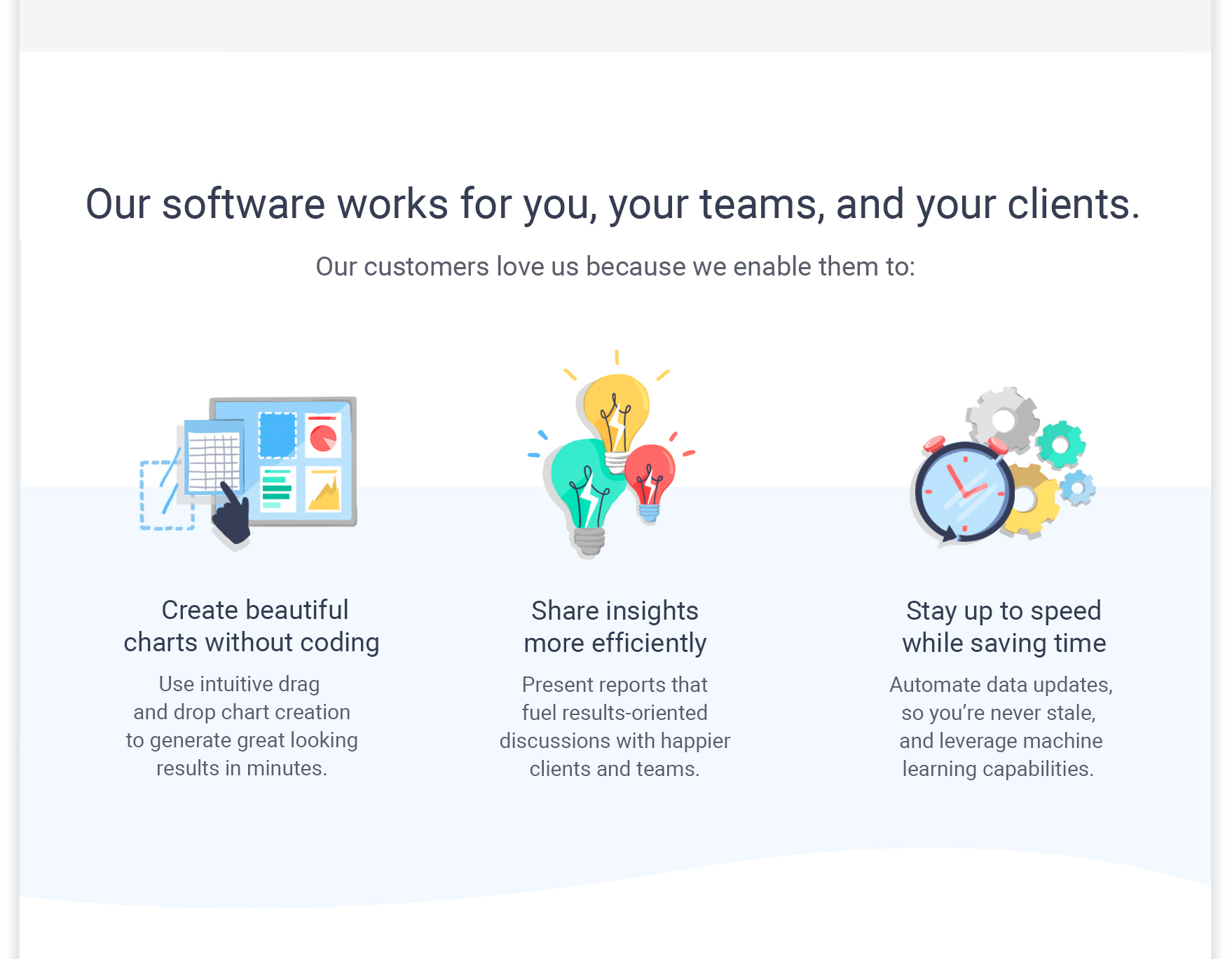
In our initial exploration, it quickly became clear that we wanted their users to make an instant connection. So we nixed depicting technical concepts and went with a character driven approach. We went with bigger characters vs. tiny figures as they were more relatable and expressive. I refined the characters' design to make sure they were not stiff and used body language to convey being engaged, connected, and in action. All within a more modern and bright palette.


Another priority was to make all users feel represented and included. Since the company wanted to focus on the roles and industries their product could support, rather than target a specific demographic, it was important to depict diverse characters in varied industries. So, I explored a range of physical features like hair styles, skin color, face shapes, and fashion.
We also wanted to avoid a common bias in the tech industry of users only working on a desktop at a desk. I explored reflecting the day-to-day work life in different forms, illustrating various lifestyles and workspaces.

Metaphor & voice
In my research, I found that the language surrounding data was very tied to water. The flood, the tsunami, drowning in data. While water as a metaphor made sense, I wanted to get away from the fear of overwhelming big data. This company was all about ease, so I utilized flowing curves--a wave, if you will.
We also realized that whenever possible, extra details communicating a personal touch go a long way in humanizing illustrations, especially ones without characters. The whimsical glare of a surface or hand drawn shimmer of light bulbs adds a lot of personality to otherwise stock icons.
While the copy I drafted served as a placeholder, I still wanted to indicate the concepts and do so in a simple, concise tone.
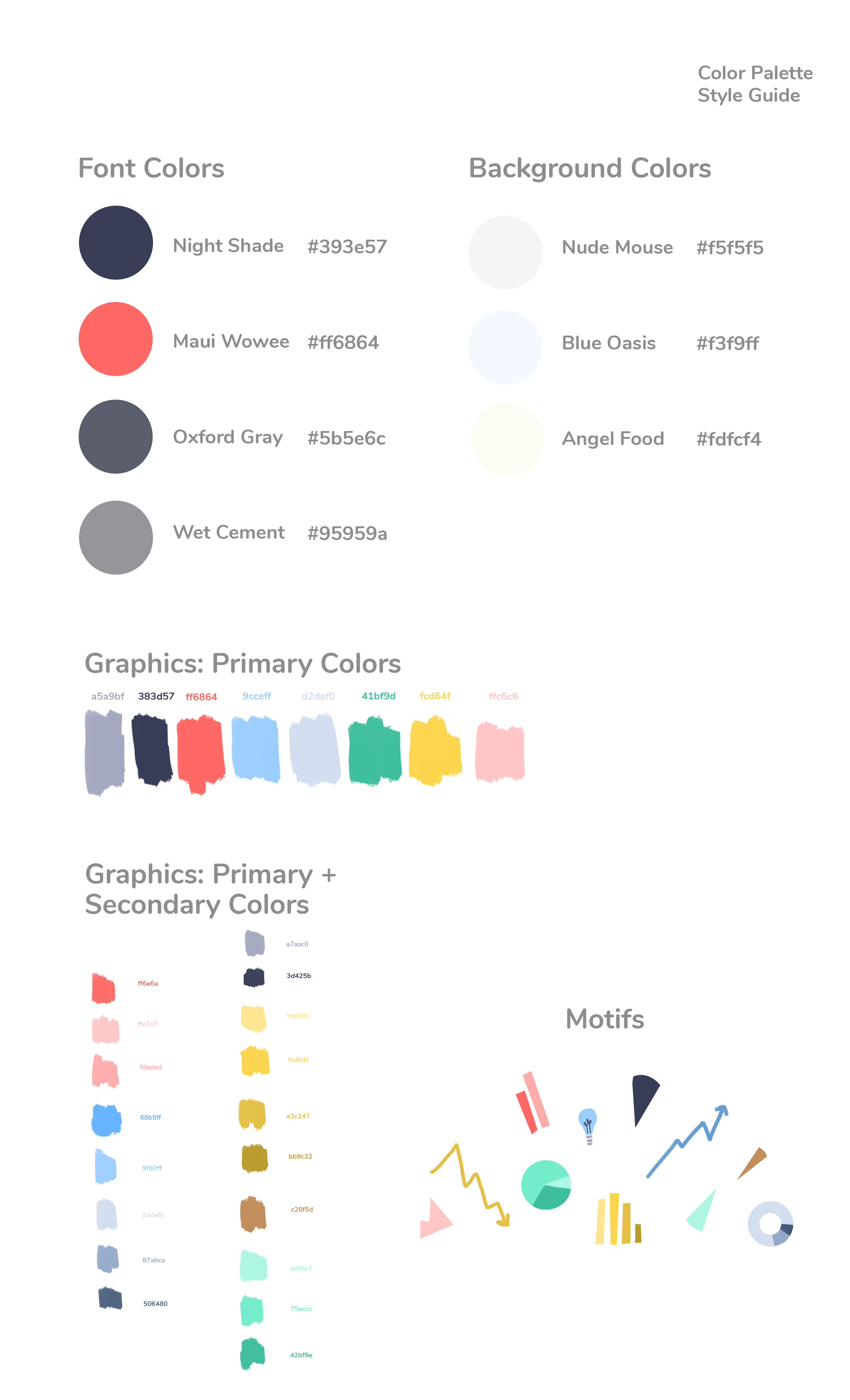
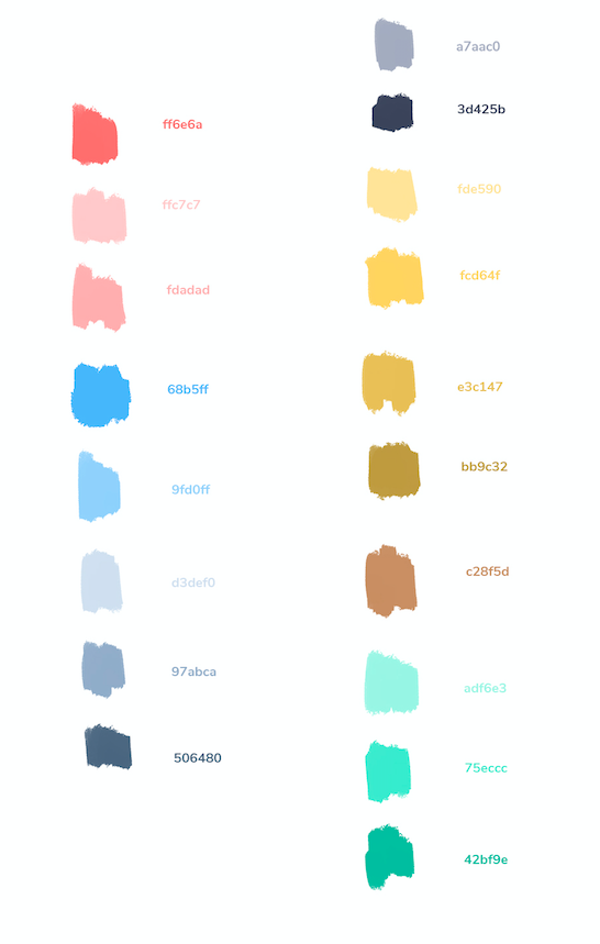
Extending to a cohesive brand
With the wireframe of the new homepage, the illustrations, and the intentions and direction of the rebrand clarified, the brand could be extended into other areas like their product, emails, and of course other pages on the site. Here are snippets of style guides for typography and color.
It was fascinating process to see how reestablishing the foundation for the brand influenced product development and vice versa. I'm excited for the next steps of developing versatile brand assets and extending out to grow the company's visual system.